You may have noticed that this past year CENTRO underwent a massive makeover.⚒️ With the help of our friends at Tembol and Nuno Studio, we refreshed our brand with a new logo, website, and vibe that reaffirms our community-centered mission. 🤝🏽
CENTRO’s brand refresh is meant to bring a renewed focus on our origins as an organization that was created by the community to preserve and honor our lived experiences and history. We describe our new graphic identity, and general ethos, as “Retro-Futurism”: drawing inspiration from the past in order to move forward.
So what’s different?
OUR LOGO
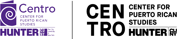
The new logo, rendered in the shape of an amplifier, is a call back to CENTRO’s activist roots when it was founded in 1973 by a coalition of students, faculty, and activists who were demanding a community-centered place for Puerto Rican Studies in the City University of New York. Among the founding principles of CENTRO was the desire to “take the mystery and oppression out of learning,” to bring the community into the university, and to “project the university outward in new ways.”
Our new logo is both a nod to the iconic megaphone of community protest and an emblem of CENTRO’s role as an amplifier in the broadest sense. It symbolizes our efforts to lift up community voices and to raise awareness of both our historical legacies and our contemporary struggles.
OUR MESSAGE AND COLORS
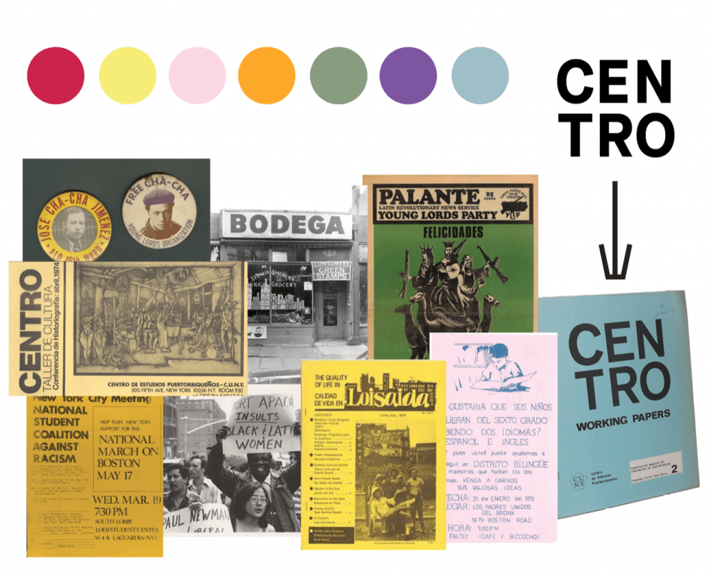
Our new color palette is also inspired by CENTRO’s origins. The points of reference were the political leaflets, posters and flyers that fill our archive, as well as the design of CENTRO’s own original pamphlets. The main logo is in black and white, in synch with the black and white protest flags currently dotting the landscape of Puerto Rico and its diasporas as symbols of both mourning and resistance.
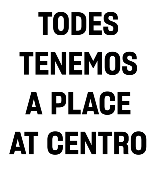
Our new brand identity embraces the use of Spanglish in an effort to foreground the creative expression that characterizes our communities, our literature, and our diaspora. CENTRO has also adopted inclusive language across all communications, employing the gender-expansive ‘todes’ to emphasize the value of inclusion and to make it loud and clear that CENTRO is a place for all languages, all backgrounds, all disciplines and all perspectives. Now more than ever, CENTRO is committed to inclusivity and diversity as a founding principle of critical thought and action.
OUR WEBSITE
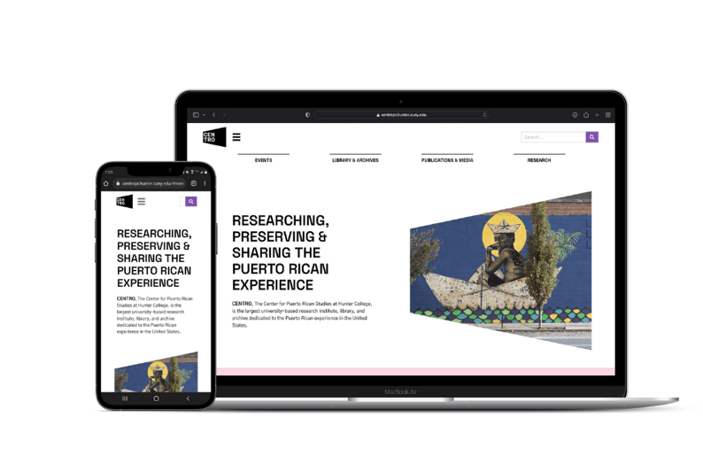
Our new website centers our inclusive values through a design that makes it easier to navigate and accessible to all. The new site also makes it possible to deploy industry-leading interactive digital tools for our interactive reports that offer rich information, maps and data visualizations on Puerto Rico and the diaspora.
Starting this summer, the landing image on our website will be a place to highlight the artistic diversity of our community. Each month we will feature a new visual artist with a full profile and bio. These profiles will eventually become part of a new digital archive of the Diasporican Arts that will serve educators and researchers.
This rebranding effort is just one of the many changes underway at CENTRO. Let us know what you think and stay tuned for all that we have in store for you next semester!
Like what you see? Let us know your thoughts about any of our initiatives by writing to centro@hunter.cuny.edu.